Online Color Picker Tool Tutorial
Learn how to pick, convert, and analyze colors across multiple formats using every feature of this tool.
🎨 What Is a Color Picker Tool
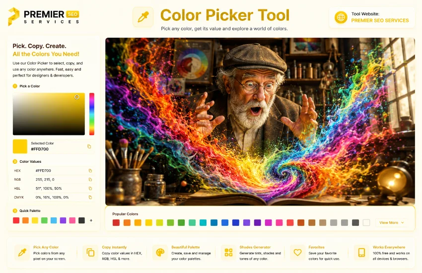
A color picker tool online is one of those essential utilities every designer, developer, and content creator reaches for regularly. At its core, it lets you select any color and instantly see its representation in multiple formats. Instead of manually converting between HEX, RGB, HSL, and CMYK or guessing values, the tool does all the heavy lifting for you. You click a color, and everything updates in real time. This particular color picker tool goes a step further by including a shades and tints generator, a quick palette of popular colors, and detailed metrics like brightness, luminance, and contrast ratio. Whether you are designing a website, creating graphics for social media, or picking colors for a branding project, this tool gives you everything you need in one clean interface.
★ Key Features at a Glance
Before walking through the details, it helps to understand what this tool packs under the hood. The interface is split into two main columns. On the left, you get the color picker itself, a hex input field, and four format displays with individual copy buttons. On the right, you get a color details panel with four metrics, a shades and tints row, and a quick palette of twenty preset swatches. Everything updates instantly as you interact.
# Understanding the Four Color Formats
One of the most useful things about this color picker tool online is that it shows you every major color format simultaneously. You do not need to memorize conversion formulas or switch between different websites. Here is what each format represents and when you would use it.
Each format row has its own Copy button. Clicking it copies the exact formatted string, including the function name and parentheses for RGB, HSL, and CMYK. This means you can paste directly into CSS files, design software, or print layouts without any extra formatting.
📌 How to Use the Color Picker Tool
The tool is designed to be intuitive, but walking through each interaction helps you discover features you might otherwise miss. Here is a complete step-by-step guide to using every aspect of this hex color picker tool online.
Pick a Color Visually
The large colored swatch at the top of the left panel is a native HTML color input. Clicking it opens your operating system color picker, where you can choose any color using a visual spectrum, sliders, or by entering values directly. As soon as you select a color, every other part of the tool updates: the four format displays, the color details, the shades and tints, and the thumbnail preview. This is the primary way to interact with the tool.
Type a Hex Code Manually
If you already know the exact hex code you want to work with, type it directly into the hex input field. The field automatically converts your input to uppercase for readability and validates that the value is a proper six-character hex code. If the code is valid, all displays update instantly. If it is invalid, nothing changes, which prevents accidental data corruption. This is particularly useful when you are matching a specific brand color or copying from a style guide.
Click a Palette Swatch
Below the color details panel, the Quick Palette section displays twenty pre-selected colors spanning the spectrum: reds, oranges, yellows, greens, teals, blues, purples, pinks, grays, black, and white. Clicking any of these swatches immediately selects that color and updates everything. This is the fastest way to jump between common colors or explore variations without reaching for the system picker every time.
Copy the Format You Need
Once you have the color you want, each format row has a Copy button on the right. Clicking HEX, RGB, HSL, or CMYK copies that specific representation to your clipboard. A visual checkmark briefly replaces the button text to confirm the action. This eliminates the need to manually select text and right-click, making the workflow much faster when you are switching between tools repeatedly.
📈 Exploring Color Details and Metrics
Beyond simple format conversion, this rgb color picker tool provides valuable analytics about the color you are working with. These metrics help you make informed design decisions.
Brightness gives you a quick sense of how light or dark the color is on a zero to one hundred percent scale. Luminance is a more mathematically precise measurement that accounts for how the human eye perceives different wavelengths. The text contrast feature automatically recommends whether white or dark text would be more readable on your chosen background color. The contrast ratio is calculated following WCAG guidelines, which is essential for accessibility compliance. A ratio of 4.5:1 or higher is recommended for normal text.
🌙 Shades and Tints Generator
One standout feature of this color code picker tool online is the built-in shades and tints generator. Below the color details, you will find a row of nine small swatches. The middle one is your base color. To the left, you get progressively darker shades at minus twenty, minus forty, minus sixty, and minus eighty percent. To the right, you get progressively lighter tints at plus twenty, plus forty, plus sixty, and plus eighty percent. Each swatch shows its percentage offset and is clickable. Clicking any shade or tint sets that as your new base color and regenerates the entire row. This makes it incredibly easy to build monochromatic color schemes for gradients, hover states, borders, and backgrounds without manually calculating each variation.
🌎 Practical Use Cases for This Color Picker Tool
Knowing when and why to reach for a color palette picker tool makes it a more valuable part of your workflow. Here are real scenarios where this tool shines.
Web Design Color Selection
Pick a primary brand color and instantly see its shades for hover states, borders, and backgrounds. Copy the HEX values directly into your CSS without switching tabs.
Graphic Design Projects
When working in design software, use HDMI output to see colors on a large monitor. Copy RGB or HEX values from the tool and paste them into your design application.
Print Design Preparation
For anything going to print, grab the CMYK values directly. The tool calculates proper C, M, Y, and K percentages based on your chosen color so your prints match your screen.
Accessibility Checking
Use the contrast ratio metric to verify that your text colors meet WCAG guidelines against their backgrounds. Adjust until you reach at least 4.5:1 for normal text.
💡 Tips and Best Practices
Getting the most out of this free online color picker tool comes down to knowing a few practical techniques. These tips will help you work faster and make better color decisions.
Save Your Favorite Codes
Keep a document or note with the hex codes of colors you use regularly. This tool makes it easy to copy and catalog them for future projects.
Use Shades for Depth
Instead of picking separate colors for buttons, backgrounds, and borders, start with one base color and use its shades and tints. This creates visual harmony.
Always Check Contrast
Before finalizing text colors, look at the contrast ratio. A ratio below 4.5:1 means some users will struggle to read your content. Adjust accordingly.
Use CMYK for Print
If your project is going to print, always verify the CMYK values. Screen colors can look significantly different on paper, and having accurate print values from the start saves rework.
🚀 Getting Started with Your Color Workflow
Whether you are a seasoned designer or someone just starting to explore color, this web color picker tool online gives you everything you need in one place. The real-time updates mean you never have to guess how a color looks in a different format. The shades generator saves you from manually calculating variations. The contrast metric helps you build accessible designs from the start. And with the quick palette and copy buttons, you spend less time on busywork and more time being creative.
The best way to learn is to open the tool and start experimenting. Pick a color you love, explore its shades, copy it in different formats, and see how the metrics change as you move across the spectrum. Before long, checking contrast ratios and switching between formats will become second nature.