Mobile View Friendly Test Tutorial
What Is a Mobile Friendly Test
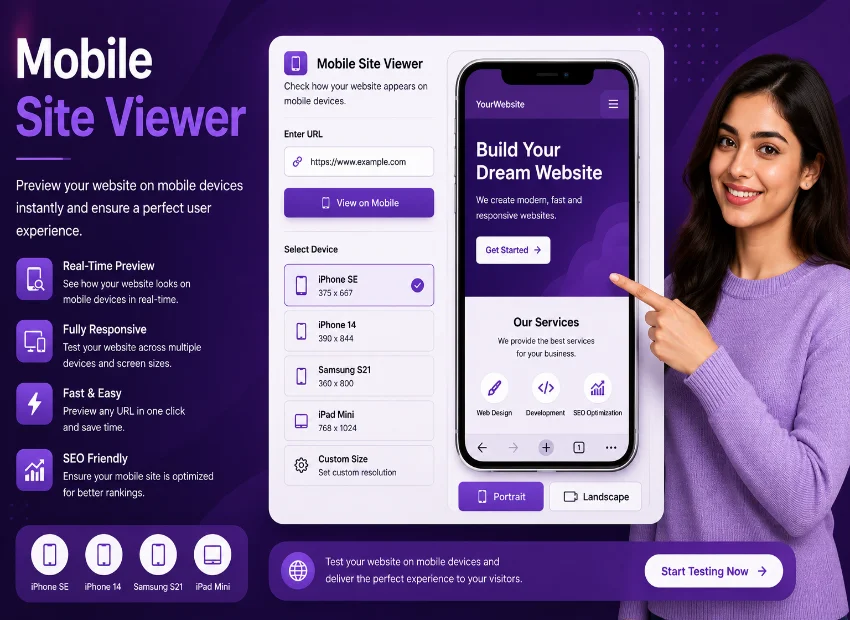
Building a website that works well on phones and tablets is no longer optional. With most traffic coming from handheld devices, checking your layout across different screen sizes is a must. This mobile site viewer gives you a complete mobile friendly test experience with real device previews and performance data, all in one place. You enter a URL to view my site on mobile, and within seconds you see exactly how your site looks on iPhones, Galaxy phones, iPads, and more.
How This Mobile Friendly Test Tool Works
The interface is built around familiar device outlines. Each phone or tablet preset wraps your site inside a realistic shell complete with status bars, notches, and home indicators. This is not a generic preview it matches the actual dimensions of popular models like the iPhone 15 Pro, Samsung Galaxy S24, and iPad Air. Understanding what this mobile site viewer offers helps you diagnose layout issues before real users encounter them.
How to Test Website for Mobile Friendly
Getting started takes only a few seconds. Paste or type any URL into the input field at the top and press the Test button. The tool automatically adds https if you forget the protocol. Once you hit Test, the page populates with device cards showing your site on nine different smartphones and tablets simultaneously. This is the simplest way to view my site on mobile without installing any software or opening developer tools.
Each device card loads your site in a real iframe sandboxed for security. A thin white spinner appears while the page renders, and it disappears automatically once loading finishes. You also get error handling if a site blocks embedding, a clean error message appears inside the device frame so you know the preview is blocked rather than broken. This option to view my site on mobile gives honest feedback about embeddability too.
Mobile Friendly Tester and Mobile View Website Checker
The toolbar sits directly below the header and gives you three category filters: All Devices, Phones, and Tablets and iPad. Clicking a filter instantly rearranges the grid to show only matching devices. This is especially handy when you want to focus specifically on tablet layouts without scrolling past phone previews. The mobile site viewer also remembers your active filter as you refresh devices or change orientation.
Orientation switching is another powerful feature. The toolbar includes portrait and landscape toggle buttons with clear icon indicators. Flipping to landscape mode swaps the width and height dimensions of every device card simultaneously. Designers often use this to view my site on mobile and verify that horizontal layouts, image galleries, and tables still look natural when the user rotates their phone.
Mobile View Test Website Portrait and Landscape
-
1Enter any URL
Type or paste a website address and click Test. The tool auto-adds https if you omit the protocol.
-
2Choose your device category
Use the filter tabs to show all devices, only phones, or only tablets based on your testing focus.
-
3Toggle orientation
Switch between portrait and landscape to see how your layout adapts when users rotate their device.
-
4Add custom sizes
Need a specific viewport? Use the custom device modal to create any width and height.
The tool ships with nine built-in device definitions covering the most common phones and tablets on the market. Each preset includes the exact screen resolution, a category tag, and visual details like notch or dynamic island styling. You are not limited to these presets though. The Add Custom Size button opens a modal where you define your own device name, width, height, and category. This is the mobile view test website feature that makes the tool adaptable to niche screen sizes you care about.
No installation required. The tool runs entirely in your browser. Just paste a URL and click Test. All device previews are rendered through iframes, and PageSpeed scores come directly from Google's public API.
Some sites block iframe embedding with X-Frame-Options or Content-Security-Policy headers. This is a security measure set by the website owner. The tool shows a clean error message inside the affected device card so you know the site is intentionally blocking previews.
Each preset uses the exact screen resolution of the real device in CSS pixels. The visual shell (notch, status bar, home indicator) matches the actual hardware design, giving you a preview that closely mirrors what users see on their specific device.
The tool fetches both mobile and desktop performance scores from Google PageSpeed Insights. A score of 90 or above is good, 50 to 89 needs improvement, and below 50 is poor. You also get First Contentful Paint and Largest Contentful Paint values alongside the score.
Each device card has a screenshot button that opens a thum.io capture at that exact viewport size. You can also open any device preview in a new browser tab or use the full-view zoom modal for a larger look.
Built-In Mobile Friendly Testing Tool with PageSpeed
Beyond visual previews, the tool pulls live performance data from Google PageSpeed Insights. Two parallel requests run the moment you click Test one for mobile strategy and one for desktop. The speed bar shows both scores as ring gauges with color coding. Green means good, amber means moderate, red means poor. A badge also displays whether the URL is considered mobile friendly based on the score threshold. This mobile site viewer effectively combines layout preview and performance testing in a single workflow.
The speed bar also shows First Contentful Paint and Largest Contentful Paint timing metrics. These tell you how quickly the page starts rendering content and when the main content block becomes visible. A PageSpeed Screenshot button appears when Google provides the final rendering capture, giving you a visual reference of what the speed test saw at the moment of measurement.
Running a Mobile Friendly Website Test with Custom Devices
The Add Custom Size button opens a modal where you define a unique device profile. Enter a name, width, height, and pick Phone or Tablet category. The tool then includes your custom device alongside the built-in presets. This is particularly useful for testing on emerging devices or specific screen sizes that your analytics data shows as popular among your audience. A proper mobile site viewer should cover the actual devices your visitors use.
Test Mobile Friendly Website with Zoom and Screenshots
Every device card comes with four action buttons. The refresh icon reloads just that device iframe without rerunning the full test. The external link icon opens the URL in a new tab at the device viewport size. The camera icon captures a screenshot via thum.io for that exact resolution. The magnifier icon opens a full-screen zoom modal that displays the device with enlarged shell details, useful for client presentations or detailed layout inspection. This completes the view my site on mobile workflow from preview to capture.
Who Benefits from a Mobile Friendly Site Test
Web designers use this tool to verify responsive breakpoints without leaving the browser. SEO professionals check how Google might see the page on mobile devices for search ranking insights. Developers debug layout shifts specific to certain viewport sizes. Content creators preview how their articles and images appear on phones before publishing. Anyone managing a website can run a quick mobile friendly site test to catch issues early and avoid losing mobile traffic.
Each device card also includes a subtle hover effect that lifts the device with a gradient glow ring around the shell. This visual feedback makes it easy to focus on one device at a time when you have multiple cards visible. The performance is snappy even with all nine device cards loaded because each iframe operates independently. The zoom modal adds another layer of inspection capability, letting you examine every pixel of the rendered page inside the phone shell.